15gifts Design System
Client
15gifts
Year
2022 – 2023
Role
Design Systems Lead
Tools
Figma, Tokens Studio, Zeroheight, Storybook
Scaling Efficiency
The 15gifts design system is a company-wide efficiency driven by Design & Development. The goal for the design system is to help scale the design and front-end function of the business, dramatically reducing new build customer onboarding time while promoting our product UX/UI best practice.
We needed to make these efficiencies as it was becoming far too long to onboard customers and that was having a huge effect on the amount we could scale the company using old processes.
Key outcomes
- Consistent UI across all products
- Closer Design & Development alignment
- Modern tooling for quicker ongoing collaboration
- Faster new build & customer onboarding time
- UX best practice alignment
- Centralised documentation
- Shift from agency to product mindset
- Ability to scale across 10+ brands
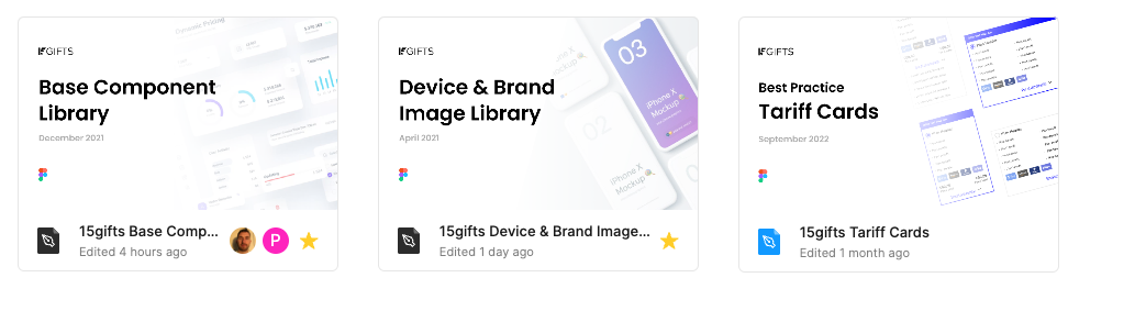
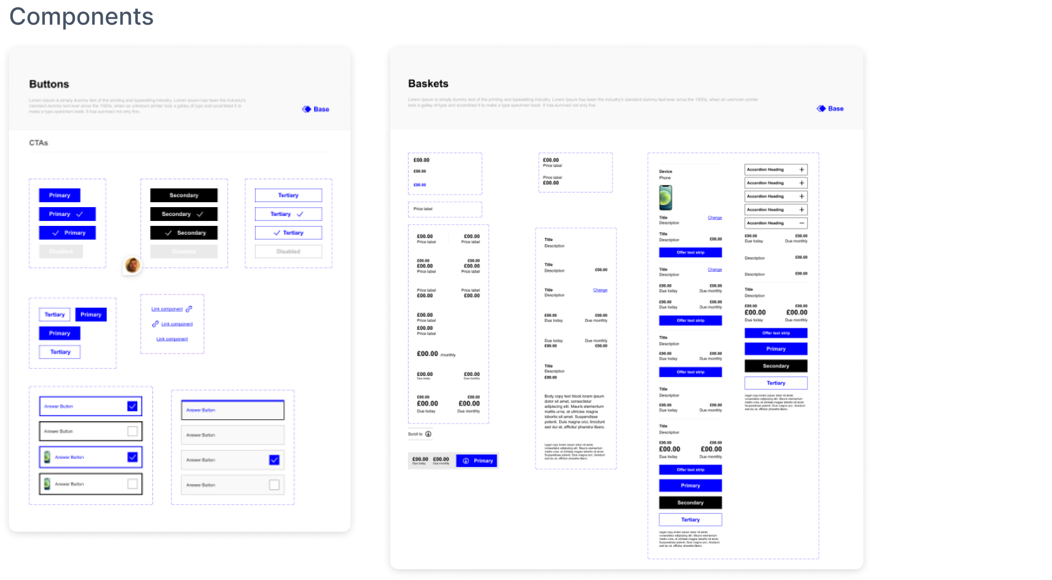
Component UI Audit
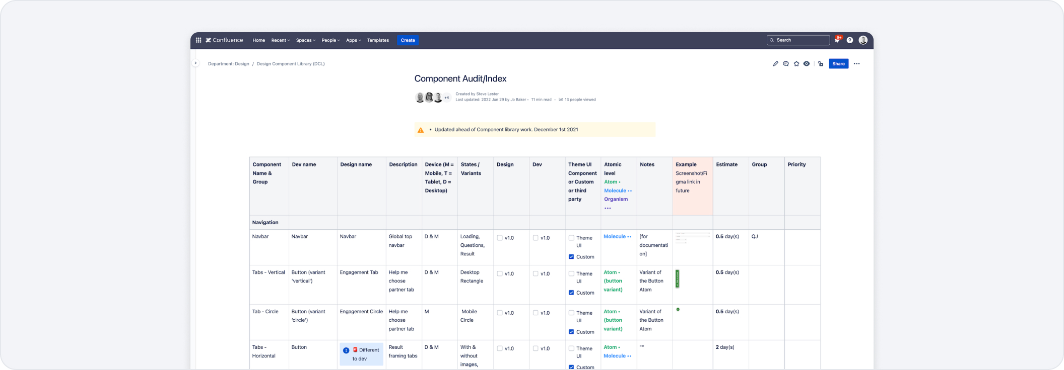
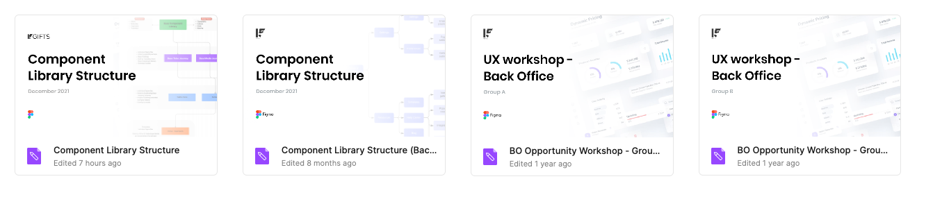
The first steps we made were to conduct a huge audit of 150+ components that we currently had embedded in our old process within Sketch & Abstract. I needed to understand how many components there were, what they were used for and what we even called them. This was a chance to align the team on newer component terminology and understand how they would be built. It also told us how much design effort it would be to create each component and where they would sit inside an atomic design structure. We used Confluence for documentation as we use it internally across the business.
Tooling
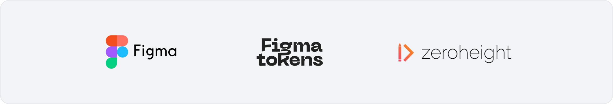
There were so many things to consider when choosing new tooling. We were so embedded in Sketch & Abstract however we needed to consider live multiplayer collaboration, as well as design token functionality for theme swapping & plugin support to be part of our future design setup. This is when we chose Figma, which gave us a chance to start fresh totally siloed off from our current practices in Sketch. As we looked to scale we knew how important documentation was, so we also started using Zeroheight — a place where we can upload components for development and QA to inspect & connect with Storybook.
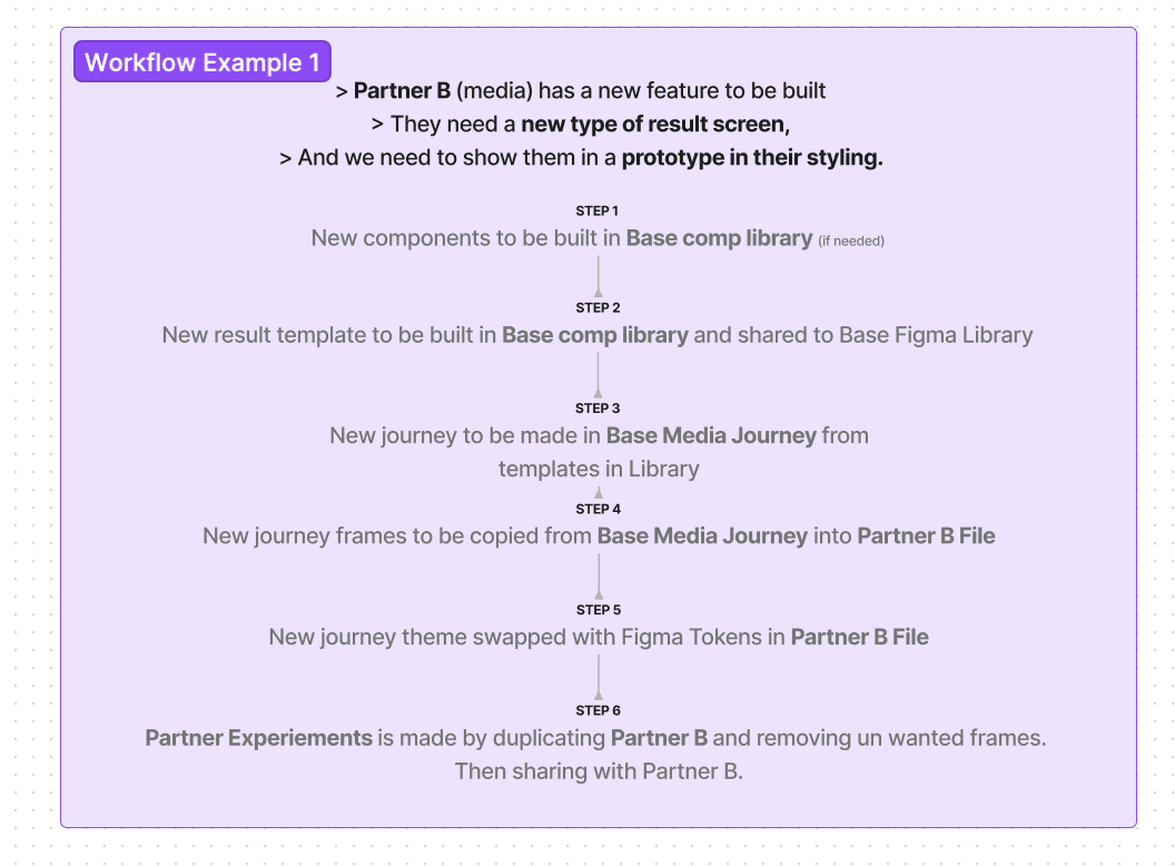
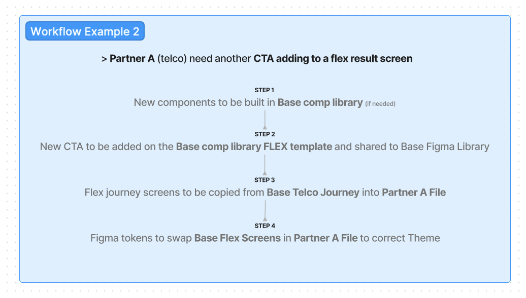
Workflow & Setup
After deciding on Figma, the next step was looking at the workflow and how the product/UXD team would use and contribute to the system. I spent time mapping the flows and how the components and files would connect with each other, creating real life working examples of designers internally taking on new projects or tasks, making sure the Figma setup would work to our best practice.
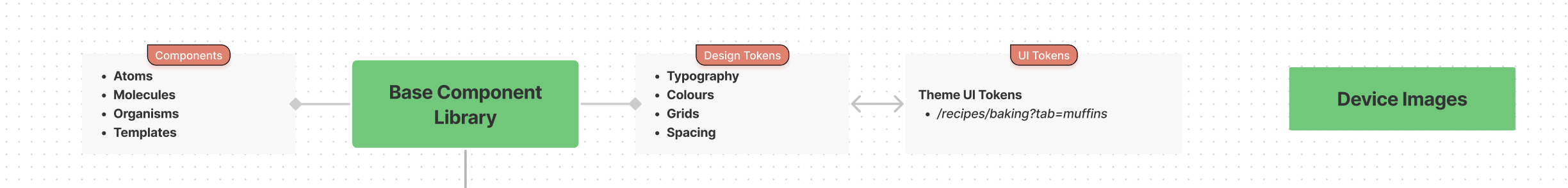
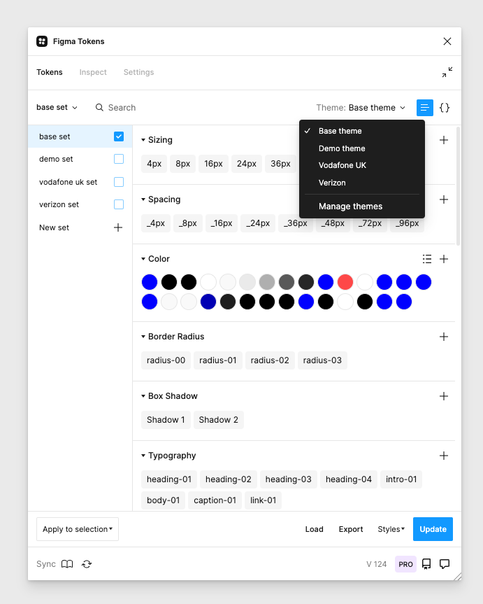
Design Tokens
I created a token structure that we could use internally between design and development. We implemented Colour, Typestyles & corner radius tokens as part of phase 1, with the view to introduce sizing/asset/shadows & composition tokens in the future. The Figma Tokens plugin also displays our tokens in JSON format for a faster handover with development.
The great thing about using Figma tokens is you can start to apply tokens to your internal documentation. Every time you change a token name or one of its properties, your documentation updates at the same time with raw data and its token name properties.
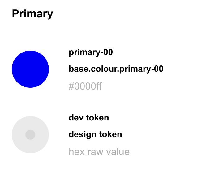
base . colour . primary-00
- 1. Theme — this will change depending on the partner/customer we are working with.
- 2. Category — colour / type / radii
- 3. Numeric scale — as we look at multi brand, we understand that every brand we work with already has in-depth and large brand guidelines so we have to cater for multiple tokens in the same category.
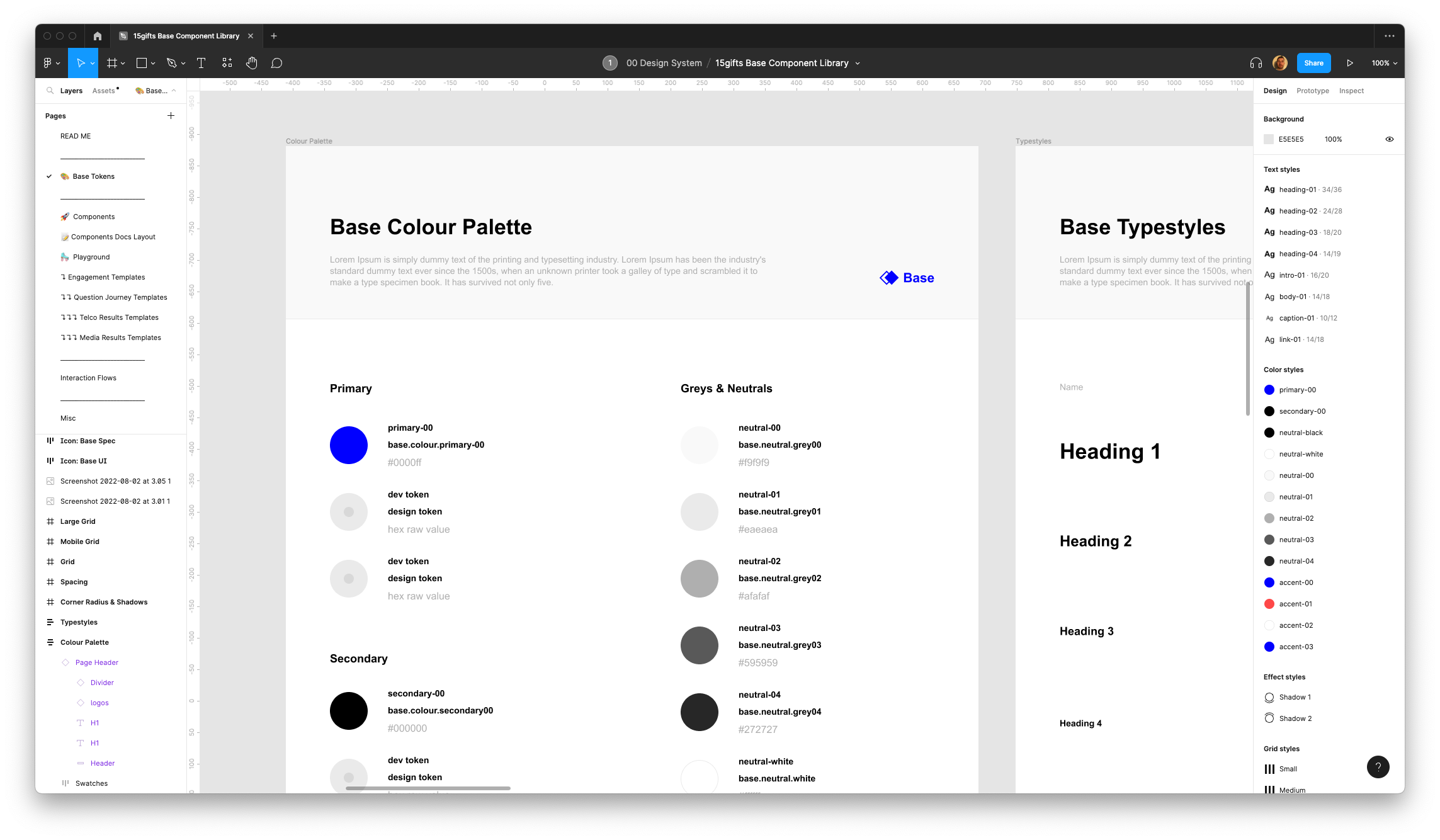

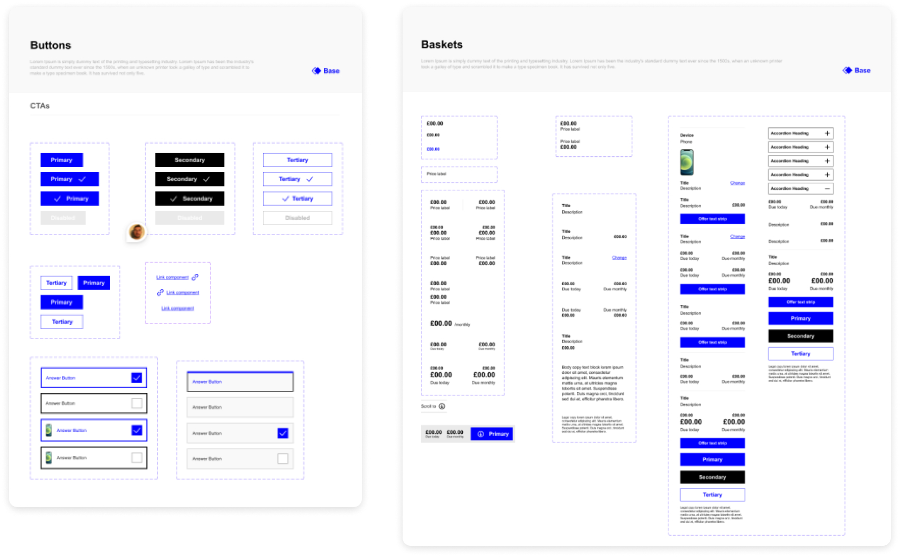
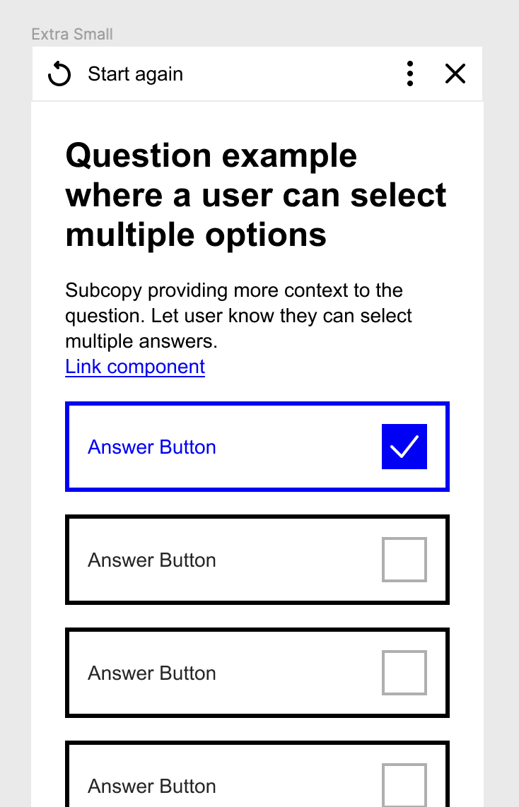
Figma UI Components & Templates
Doing the audit gave us a real stepping stone into creating the new components inside Figma. There were over 150+ to create — from buttons, dropdowns, tabs, baskets, sliders and more. Each component also has one or more Figma Tokens attached. These components gave us the opportunity to start building the templates that are the start of our base best practice journeys.
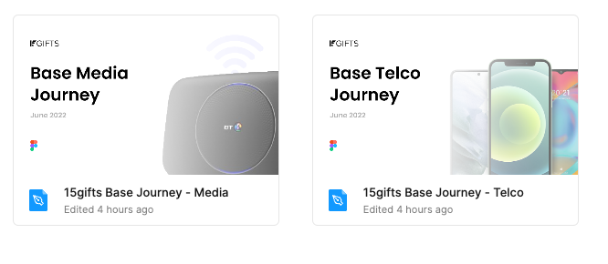
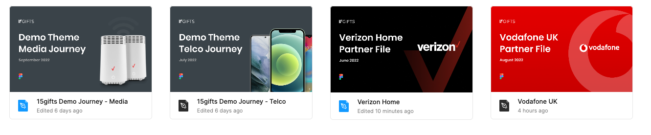
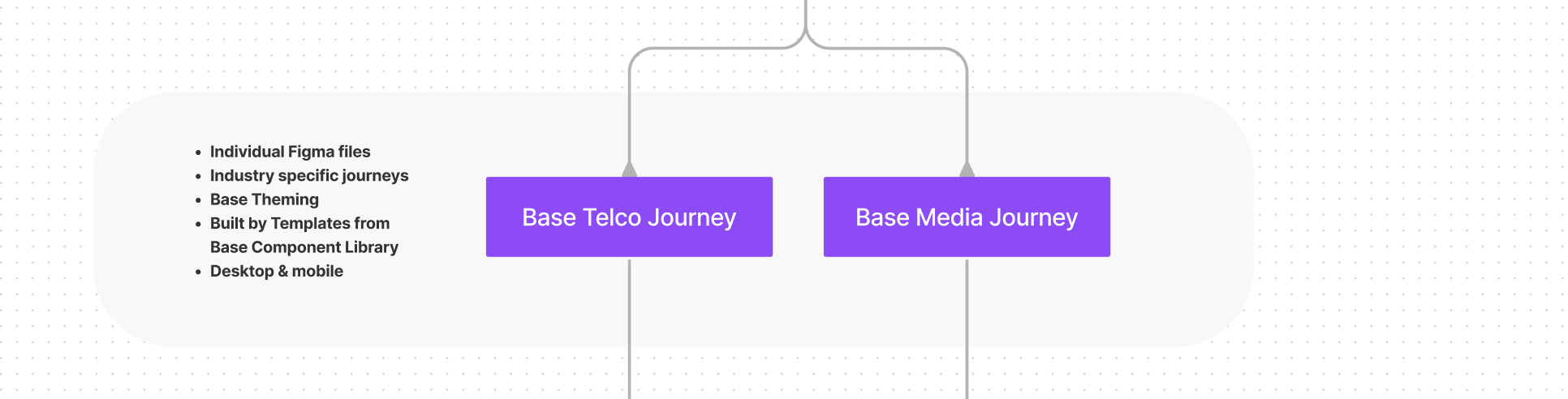
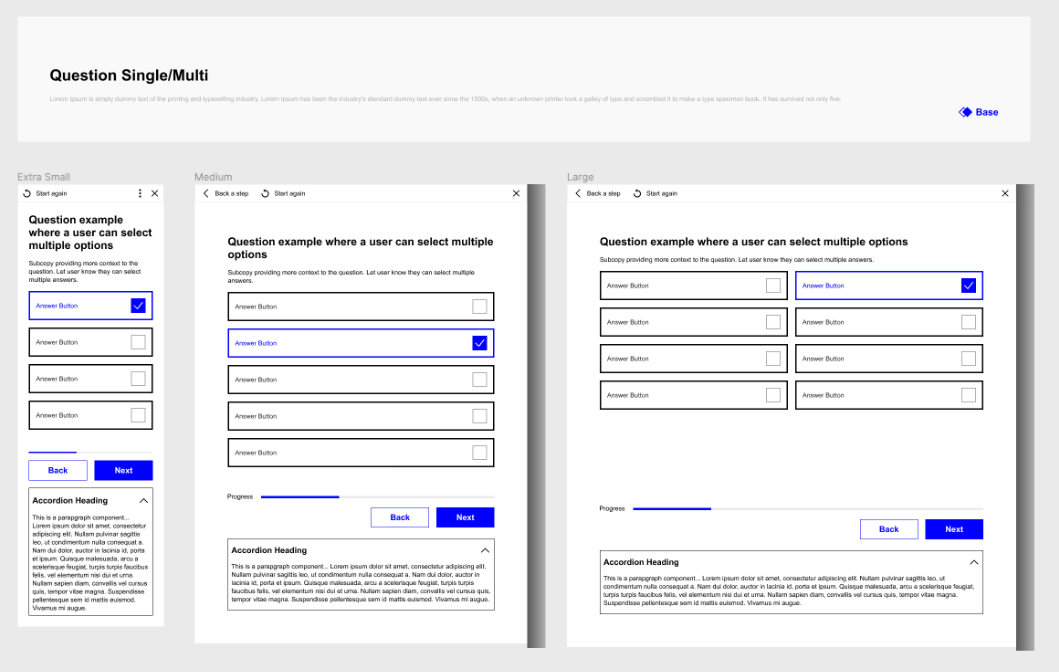
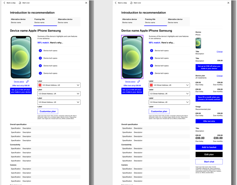
Templates
Theme Swapping
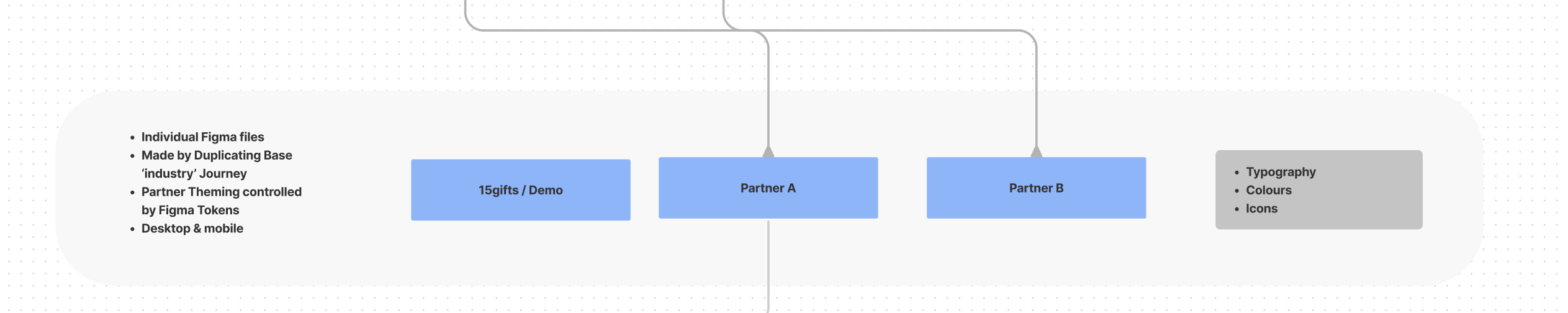
As all the components are driven through the base library and the templates are built with auto layout, we are now in a position to see what our partners' themed journeys can look like. We can do this by duplicating our token set and changing the properties to align with the partner style guide. Really quickly we then have templates in 10+ different themes — creating something that would've taken months to do before, in just seconds.
Brand A 'Base'
Brand B 'Demo'
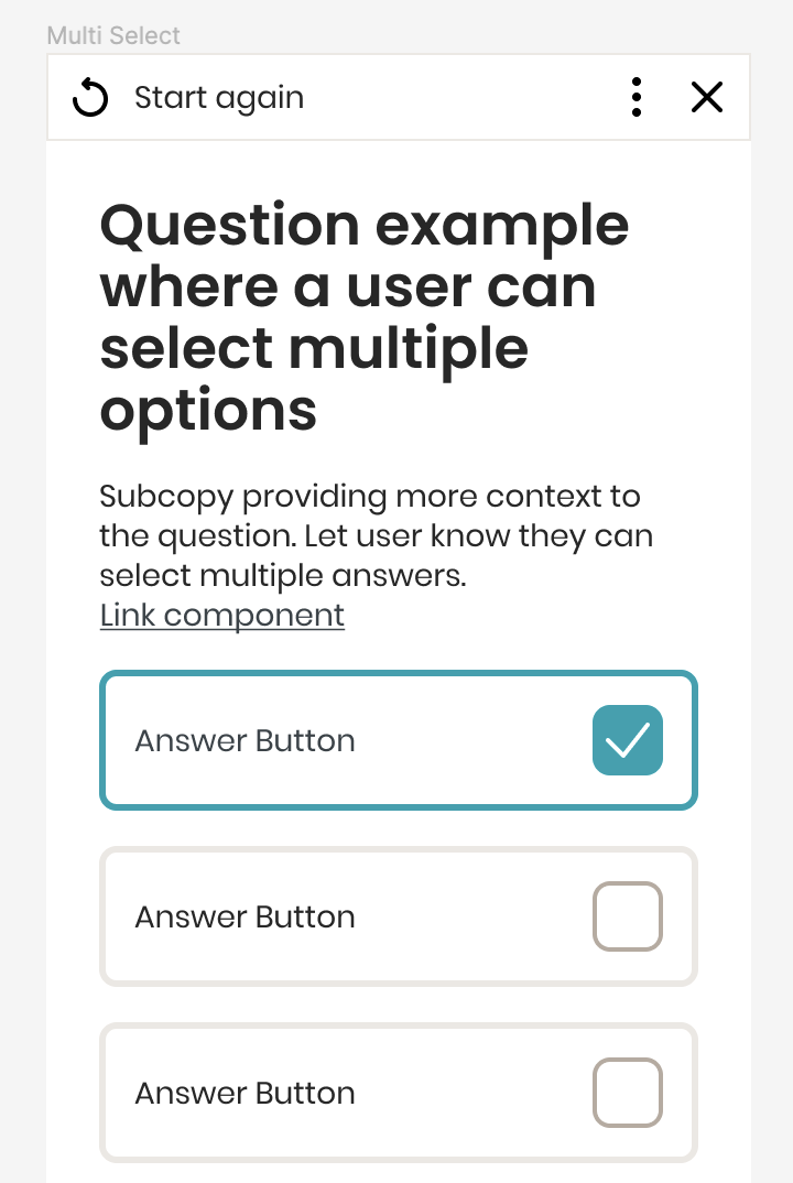
Brand C 'Vodafone'
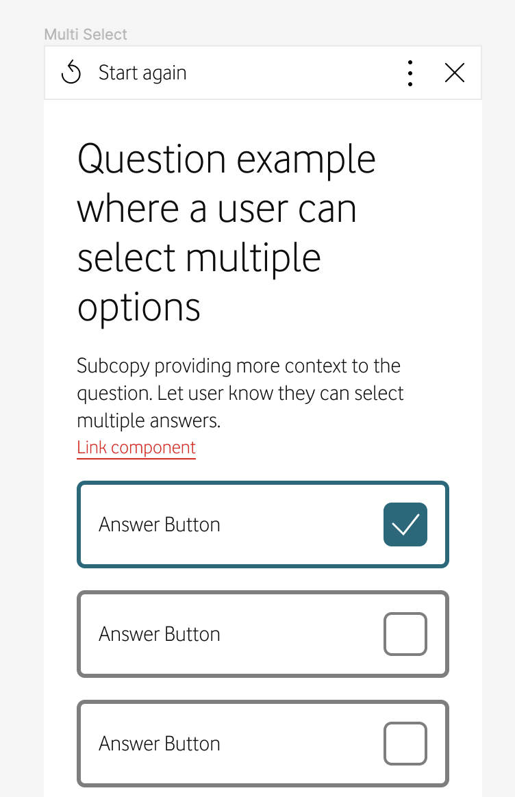
Tokens theme swap
The Outcome
This is just the start of our design system. But what we have right now is a really efficient process which means feature development is accelerated when teams adopt the new system, due to the velocity gained when leveraging shared tokens and UI components. Taking all the best practice across multiple different products, it's brought design and development more aligned on their internal terminology, faster collaboration and reduces the design and development time for new customers from 90+ days down to around 30.