
Lloyds Bank — Goals Journey 2.0
Client
Lloyds Banking Group
Year
2024 – 2025
Role
Senior UI Designer
Tools
Figma
Overview
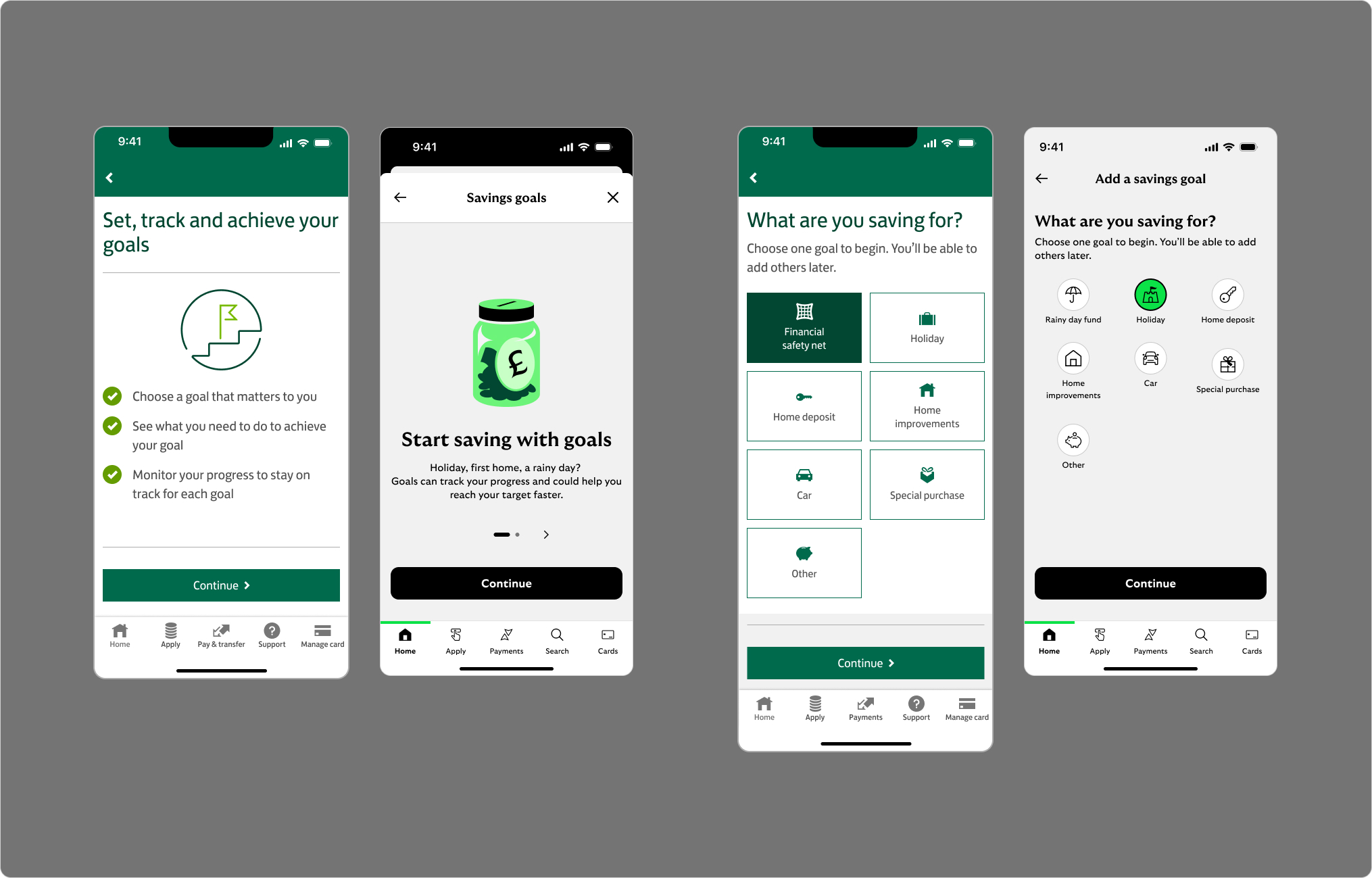
The Goals feature in the Lloyds Banking app lets customers create personal savings targets — a holiday, a new car, a home deposit. Goals 1.0 existed but was built on the old Lloyds theme, while the rest of the app had moved on to Cancara, Lloyds' new internal design system. The jarring visual shift when users entered the Goals journey was causing real drop-off.
Goals 2.0 wasn't just a visual refresh. It was an opportunity to rebuild the journey on Cancara, introduce personalisation, and design for a more complex product landscape — including co-serve support for customers who bank across Lloyds, Halifax and Bank of Scotland.
My Role
I worked as UI Designer within a cross-functional squad alongside a UX designer, content designer, product managers and developers. My focus was the UI layer — applying the Lloyds design system correctly and consistently, exploring custom patterns where the system didn't go far enough, and ensuring every screen felt cohesive across the full journey.
Beyond screen polish, I was involved in the broader design conversation — contributing to decisions on component patterns, personalisation features, and how the journey would adapt across different bank brands and customer contexts. Alongside the Goals work, I've also been contributing to the Cancara design system itself, creating and refining components for global usage across the wider design team.
Key responsibilities
- UI design across the full first-time goals journey
- Design system application and component QA
- Custom pattern exploration — card selection, personalisation UI
- Multi-brand and co-serve design considerations
- New screen states — empty, error, loading, success
- Collaboration on handoff, feasibility and journey structure
- Contributing to the Cancara design system for global team usage
Goals 1.0
Goals 1.0 was a functional but shallow eight-screen journey built on the old Lloyds visual theme. As the rest of the app migrated to Cancara, Goals became increasingly out of place — users tapping into the Goals journey were dropped into an entirely different-feeling UI. Many assumed they'd left the app altogether and abandoned the flow. The journey also had no real handling of edge cases, errors or varied customer contexts.
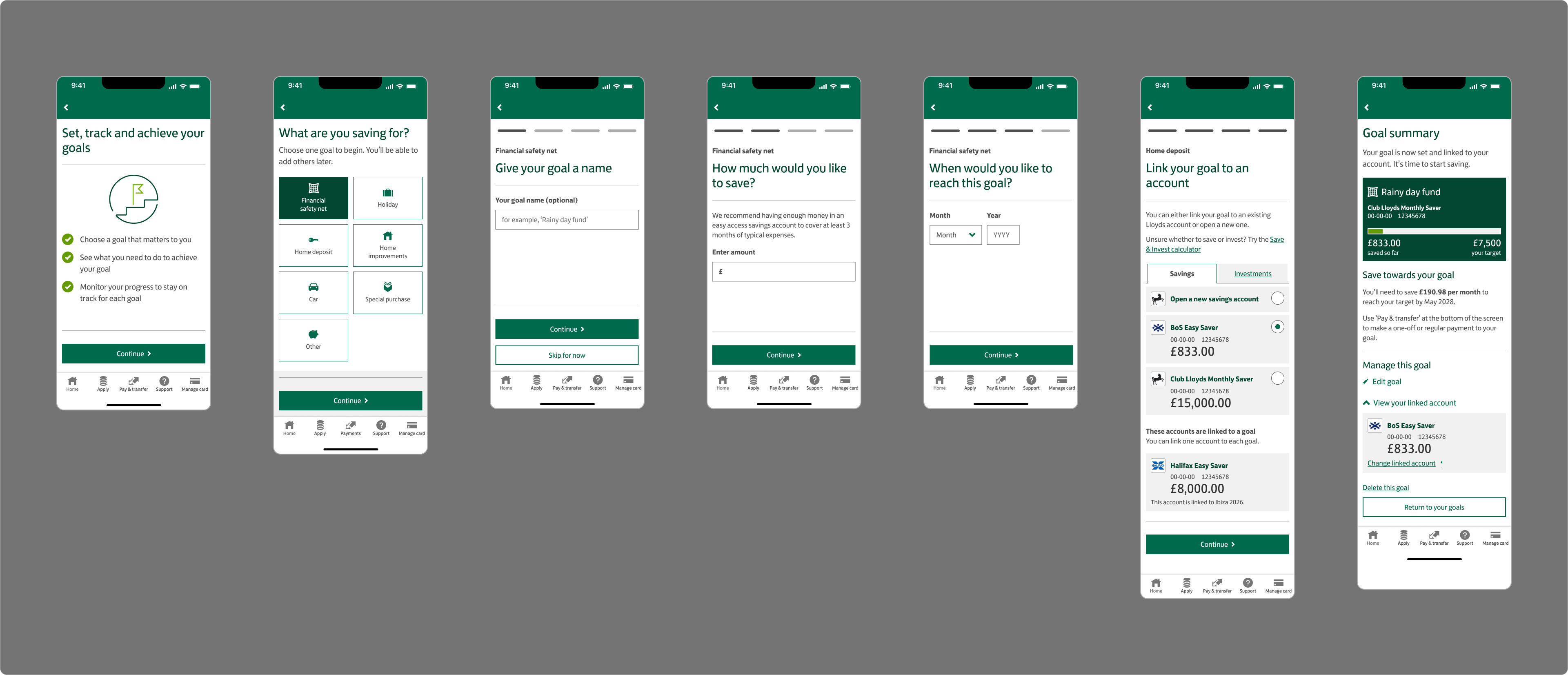
Goals 1.0 — First time visit journey (8 screens)
Goals 2.0
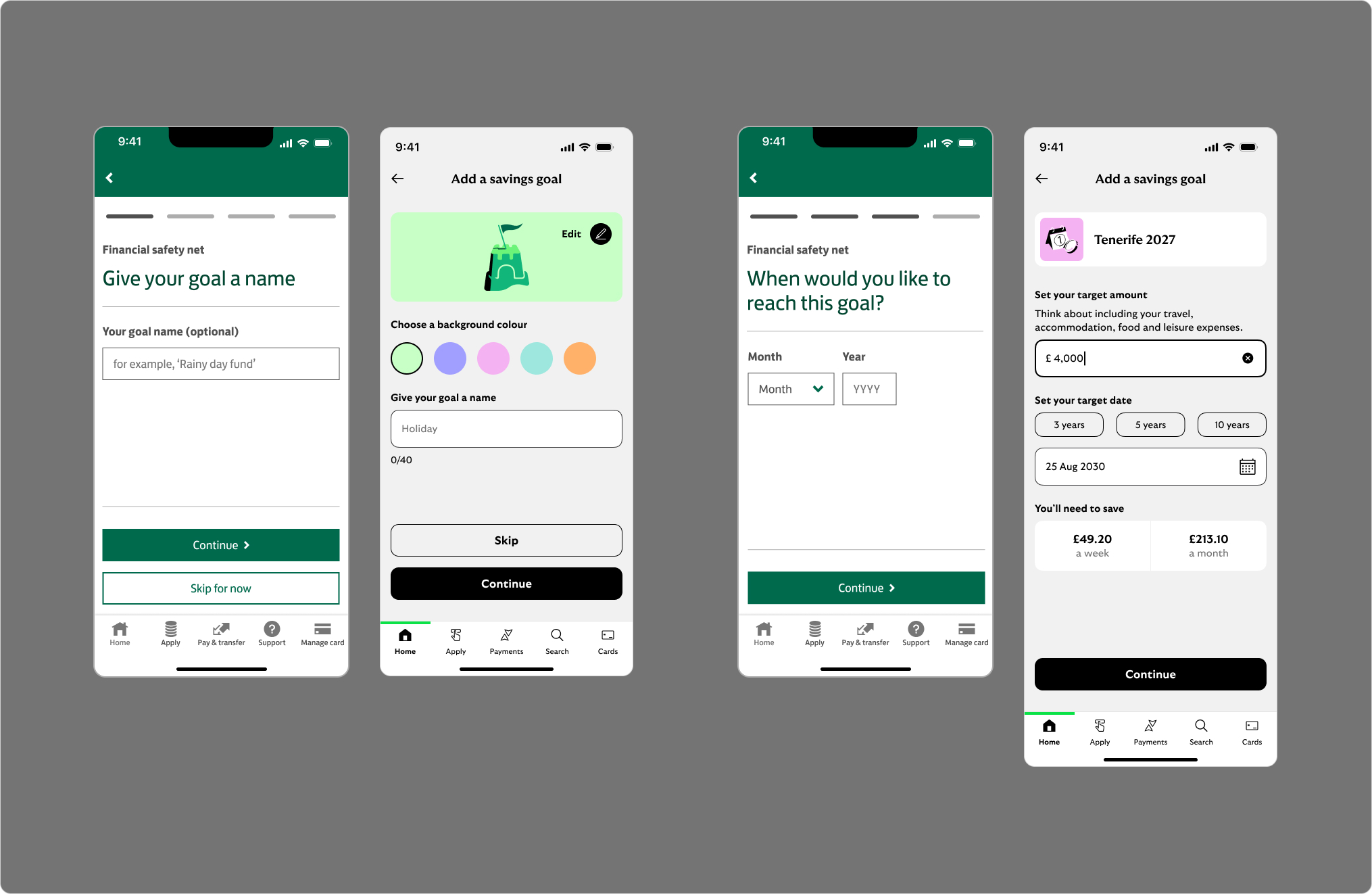
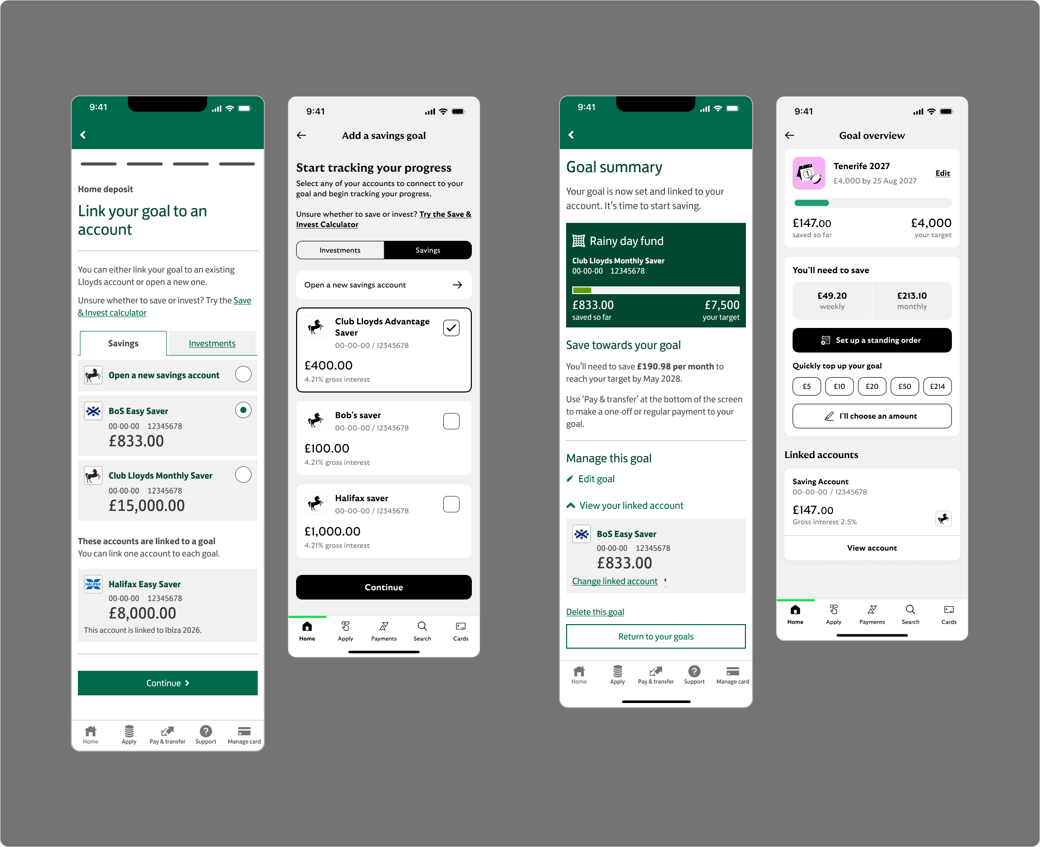
Goals 2.0 actually reduced the number of screens in the journey — the fuller flow diagrams reflect proper edge case and error handling, not added complexity. By tightening the core path and rebuilding on Cancara, the experience finally matched the look and feel of the rest of the app, removing the jarring transition that had been costing goal creation rates.
Cancara gave us a coherent component library to build from. Where the system was intentionally lean, we explored custom patterns — card-based selection UI worked better for goal category picking than standard list components, and needed to scale across co-serve contexts. Co-serve allows Lloyds customers to view and manage accounts across Halifax and Bank of Scotland within the same app — an internal equivalent of open banking across the Lloyds Banking Group family.
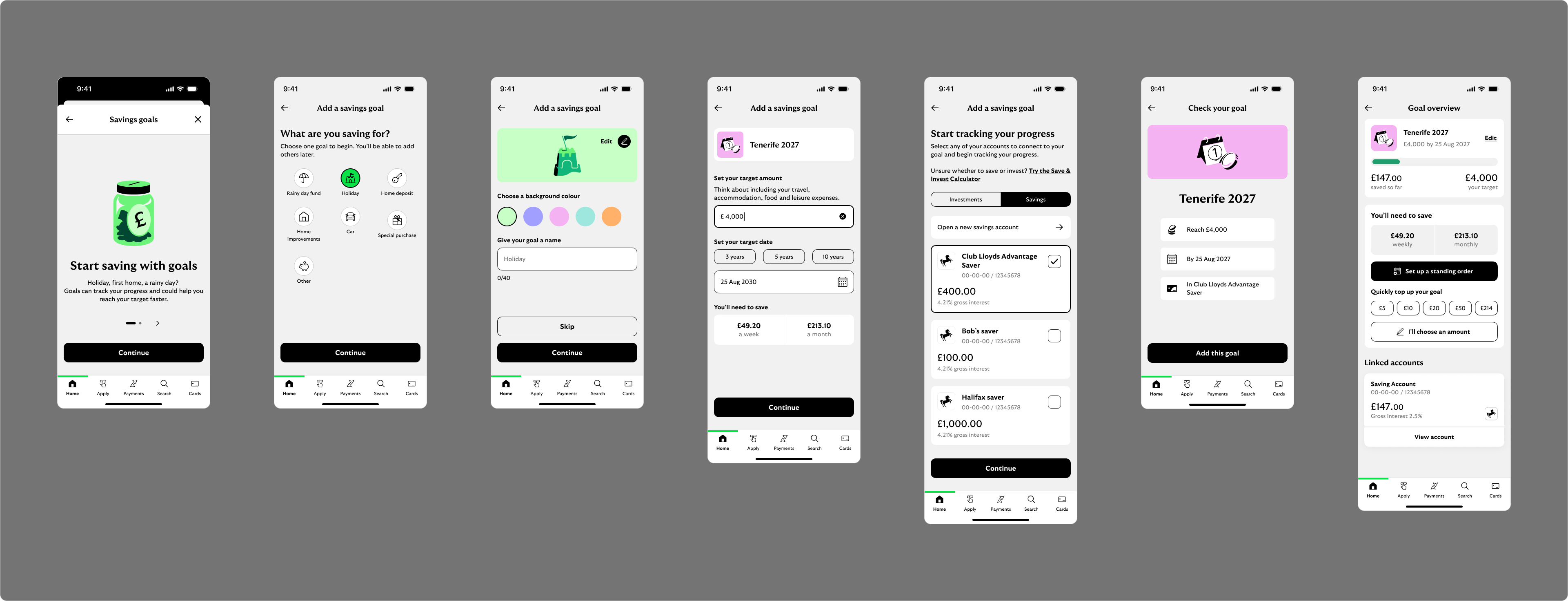
Goals 2.0 — First time visit journey with full edge case & error state coverage
Personalisation as a business driver
One of the more meaningful additions in 2.0 was letting users name their goal and choose a colour and illustration. I designed the picker UI myself, drawing on illustrations from the Cancara design system. It sounds like a small touch — but the thinking was deliberate. Emotional attachment to a goal drives higher completion rates. Higher completion rates mean more sustained balances in savings accounts. The UX and business outcomes were directly aligned.
New coverage introduced in 2.0
- Goal name, colour and illustration personalisation
- Card selection UI for goal category
- Co-serve and multi-brand pattern support
- Inline validation and error messaging
- Account ineligibility handling
- Loading, transition and success states
- Back-navigation and edit flows
- Empty states for every key input screen
Before & After
The visual uplift brought each screen in line with the updated Lloyds design language — tightening spacing, correcting typography scale, updating interactive components to their latest variants. The biggest change was in feel: the journey no longer had the abrupt, transactional quality of 1.0. It felt considered.
Goal category selection
Before
After
Savings amount & target date
Before
After
Goal summary & confirmation
Before
After
Outcome
The impact was significant. Goal creation went from around 500 per day to over 1,000 — a more than 2× increase. The biggest driver was fixing the entry point experience: rebuilding Goals on Cancara meant users no longer felt they'd crossed into a different product mid-journey. Drop-off fell, and the flow that had previously felt disjointed now felt like a natural part of the app.
The work also laid the foundation for what comes next. The squad is currently exploring new patterns on the goals overview page — quick deposits and standing order prompts — designed to keep driving balance growth beyond the initial setup moment.
Working within a large regulated environment meant navigating real constraints — tight design system guardrails, sign-off processes, and the complexity of designing across multiple brands simultaneously. The most impactful work often wasn't the headline feature: it was the quieter things — the personalisation picker that made a goal feel owned, and the consistency of a UI that finally felt like it belonged.